Renewal City Kids
Brand Design and Illustration
Stage 1
Discovery + Strategy
While working through the full brand process for Renewal City Church, we knew from the beginning that a strong kids’ ministry would be essential to the church’s success. After making meaningful progress on the main brand, we began to talk specifically about the kids’ ministry and what nuances would define the church’s approach to ministering to them.
We walked away with a few key details from Discovery, including “We want to have fun, without being a slave to fun”, the fact that the kids ministry would be entirely mobile at first, and that we prioritize speaking to parents first. We also discussed a strong theological vision for the kids ministry, originating from Mark 4. The rough idea? Kids are like seeds, and we want to give them good soil.
Following Discovery, I created three moodboards for the team to review and discuss. The purpose of these was largely to discover how much of the “kid-made” aspect of the design we might lean into, versus how much we would visually signal a more polished focus on parents and trustworthiness. The team ultimately felt most drawn to direction 1, but with the tone of direction 3.
Stage 2
Creation
After landing on a final visual style, I began drawing up multiple logo options for the team to consider. While many had potential, the RCC team quickly narrowed in on a direction I proposed that transformed our primary brand leaf mark into a mascot for the children’s ministry. From this idea, Sprout was born.
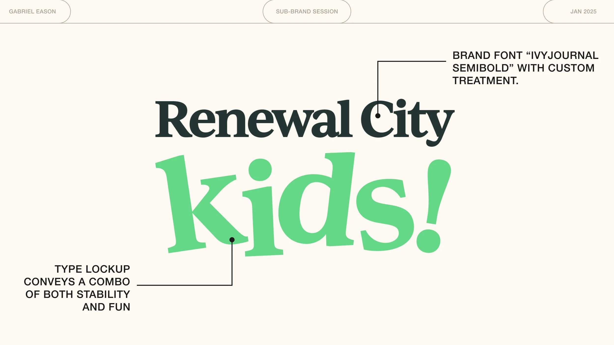
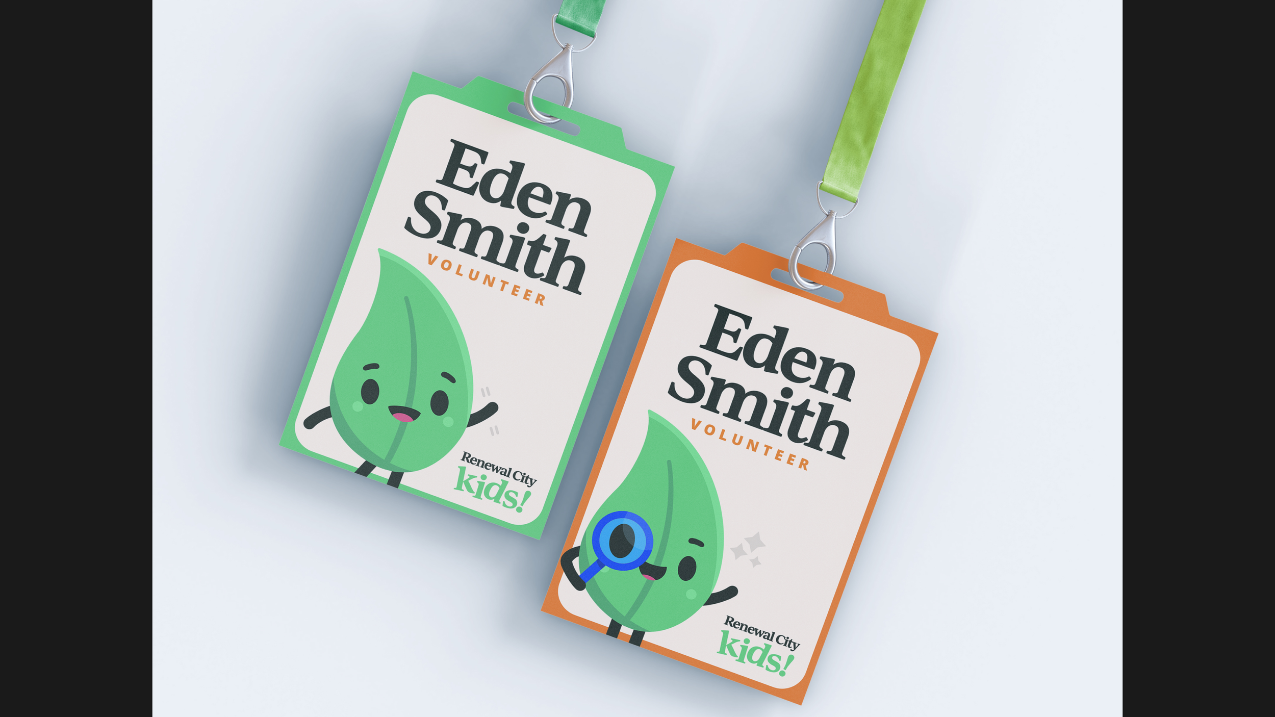
Sprout is a kid who loves Jesus, and wants all of his friends to experience the Renewal of Jesus with him. Practically, he is also the brand’s mascot, and a narrative device we utilize often when telling children about the Renewal of Jesus. Sprout has his own pages in the sub-brand guide, detailing how he functions from a technical perspective, and his personality as a character. Below is the main Renewal City Kids logo, as well as some examples of Sprout in action.
Stage 3
Launch
With Sprout being such a significant part of the Renewal City Kids brand, and also a rather unique take on a kids ministry, I made sure to include strong guidelines for him in the church’s brand guide. Renewal City Kids had its own dedicated section, which detailed the sub-brand’s positioning and story, how to build Sprout from a technical perspective, and tips for designing with Sprout as an element. Below are pages from this section:
Ready to begin?
I’d love to talk and see how I can help, even if you’re still researching or figuring things out.


