Renewal City Church
Brand Design, Sub-Brand, and Launch Kit
The Client
Renewal City Church is a vibrant church plant located in the northern Dallas-Fort Worth area. Supported by a heart for authentic, purpose-driven excellence, their vision is "The Renewal of Jesus for the Flourishing of the City".
Stage 1
Discovery
Renewal City Church approached me looking to build a brand that would capture the heart of their mission, and serve as a strong creative foundation for the next 30 years. After reviewing initial documents created by the RCC team, I had the privilege of flying out for a site visit to the location of the church plant: Celina, Texas.
We began with a discovery session with church leadership, where the team and I met to uncover the DNA of both the church and the town. Celina is the fastest growing town in America currently, and with such explosive growth, the town is full of both opportunity and growing pains. After discussing culture and local contexts, and having dinner with the rest of the launch team, we met remotely for a second Discovery Session. In this second one, we established target personas (e.g. “Who are we trying to reach?”) and discussed the Brand Voice for the church (e.g. “How would your church sound if it were a person?”)
Stage 2
Strategy
Following this, and using the notes from the Discovery Session, I created 5 different visual directions in stylescapes. Each one focused on a different aspect of the desired brand voice, as well as different themes from Celina culture. We ultimately landed on a revised version combining the best aspects of a number of them, though taking it's main cue from the vibrant “New Way” concept.
Stage 3
Creation
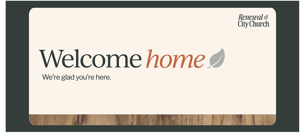
After landing on a final visual style, I created several logo concepts for the team to review. The final logo consists of two parts: a nostalgic serif font spelling out the church name in a custom lockup, and a logo mark of what we call “the Renewal City leaf”.
The wordmark exists to clearly tell outside audiences who they are, and to signal the nature of the organization (e.g. the word “church”). Stylistically, it also contains an example of the brand’s italics technique, known as the “Accent Approach”. The brand uses italics as a subtle nod to the concept of something being notably changed from the others around it. In a sense, that word has been transformed, or renewed.
The main logo mark, the Renewal City leaf, is a visual representation of Renewal City Church’s vision. They firmly believe that renewal begins at the personal level, and then spreads outwards in a ripple effect to one’s church, city, and culture. This “Renewal of Jesus” also leads to new life in those who experience it. The logo mark combines these ideas, with an illustration of a leaf (healthy, growing life) being created by the ripple effect of renewal.
Stage 4
Launch
To close out this project and make sure the Renewal City Team was well-equipped for the launch, I created a large number of deliverables. These included a full brand guide, as well as a Canva Brand Kit, multiple pieces of merchandise and signage, and other assets.
Perhaps the largest lift of the Launch stage was the development of the church’s sub-brand “Renewal City Kids”. This sub-brand was a wonderful success, and became so involved that I’ve laid it out as its own case study, here.
Ready to begin?
I’d love to talk and see how I can help, even if you’re still researching or figuring things out.


