RunAlpha
Brand Design Concept Art for Alpha Ministries USA
The Project
Alpha is an international evangelistic ministry that helps create a space for honest conversation around some of life’s biggest questions. It is designed to provide guests an opportunity to connect with one another while providing the opportunity to share thoughts, ideas, and opinions in a safe and caring environment.
RunAlpha in particular is the ministry’s training program where people learn how to put on their very own Alpha for their community. It includes an overview of the organization’s history, the values and practical steps for how to run an Alpha group.
Stage 1
Discovery
In a brand discovery process, I’m seeking to understand the core DNA of the brand I’m working on. This involves it’s history, it’s goals, it’s challenges and strengths, how it’s communicated about itself in the past, and more. This is traditionally done in a meeting or series of meetings. In this case, I did a bit of digging to uncover some details about Alpha.
I wanted to get a better understanding of the Alpha brand as a whole, and so I searched for the various ways the Alpha brand had been expressed in recent years. This came in the form of video teaching series, video thumbnails, advertisements, books, and more.
To learn as much as I could about the brand itself, I studied through the Alpha brand guidelines, grabbing key slides as needed. I also began a collection of Alpha-brand photos and logos, for reference and use when building out the new system. Lastly, I listened to a number of podcasts with Nicky Gumbel (founder of Alpha), which gave great insight on both the history and heart of the ministry.
Stage 2
Creation
After deciding on a style and strategy, I began work on crafting the new brand and deliverables. One particularly tricky aspect of this project was navigating the relationship of brands to one another in their brand hierarchy. Without getting into the smaller details here, I ultimately decided this:
This “Run Alpha” look is serving as a “sub-brand” to the primary brand, Alpha itself. As such, I followed the rules of using only Alpha brand fonts, photography, and maintaining the primary red color. I did, however, introduce new elements for discussion and to test limits.
Stage 3
Launch
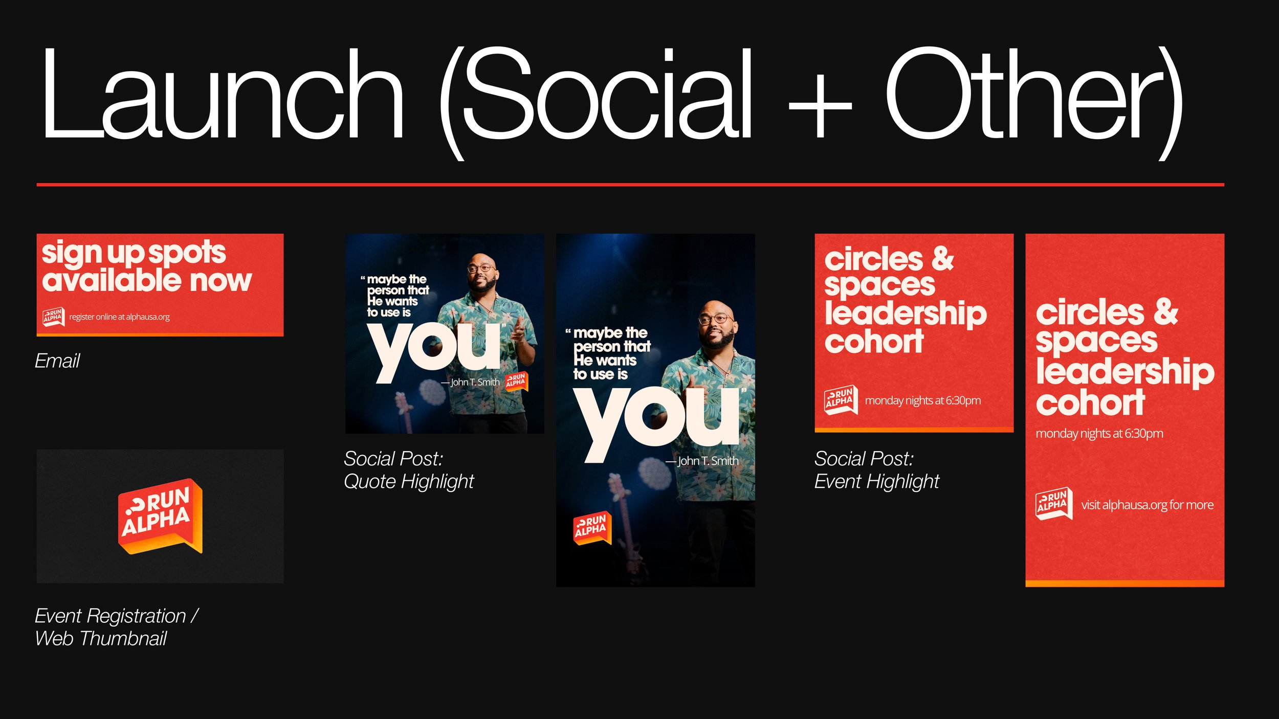
While launch typically involves releasing a finished brand to the church or public at large, in this particular case it involved creating a few specific deliverables. These were created using placeholder and were intended to demonstrate the range of the brand system at launch.
Direct from the presentation slides, here are a few of the deliverables I shared with the Alpha Team.
Ready to begin?
I’d love to talk and see how I can help, even if you’re still researching or figuring things out.


